Government Grant Search
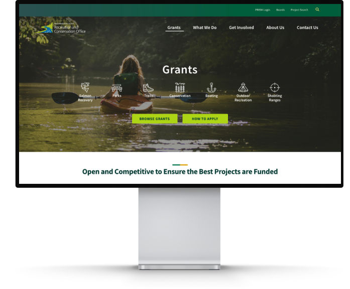
Washington Recreation & Conservation Office
A government agency website redesign allowing grant applicants to easily understand the RCO grant process and search for grants.

Overview
The Washington State Recreation and Conservation Office (RCO) is a government agency that awards grants to other agencies and businesses for recreation and conservation related projects. They needed to refresh, modernize, and unclutter their website. Additionally, the design needed to be able to extend to 2 of the agency's sisters sites covering invasive species and boating regulations.
Palador was selected for the project from a public request for proposals and won out over other local firms. Our team of 4 worked directly with the client to lead them through user-centered design process that involved mixed-method user research, a streamlined navigation, new visual design, prototyping and usability testing, and CMS selection and development.
My Role: Design Team Lead
- Led user research efforts via a survey, user interviews, and google analytics analysis
- Researched and reported on CMS recommendations
- Performed an extensive site audit and heauristic evaluation
- Led the design of the information architecture and wireframes
- Oversaw accessibility compliance in design and code
- Supervised the development of the WordPress site
Team
2 Designers, 1 Developer, 1 Project Manager
Time Frame
Nov 2018 - June 2019
01Challenge
Sorting through 10 years of web clutter
to rediscover primary content
Research
I performed an extensive site audit to map out the content so that we could work with the client to make decisions about what needed to stay on the site and what could be cut.
I collaborated with the team to create a survey, run user interviews, and analyze their Google analytics traffic to get a sense for which content was most important and which content was getting lost.
Findings
Users were getting lost in a web of pages that had built up and become disorganized over the years. Some stakeholders were hesitant to remove old documents, using the public site as a company file system. We needed to encourage proper usage of their intranet while reinforcing their commitment to help their customers, the grant applicants, through proper site organization.
Solution
A restructured information architecture
that balances users’ needs with agency goals
Site Map (wireflow)
I collaborated with the team and the client to reduce the number of pages and condense content to make the most important information easier to find. This included removing a catch-all document section and making sure documents could be found on pages with related content. I created the full site map, which was turned into this wireflow to make sure important user flows worked across pages.

Navigation
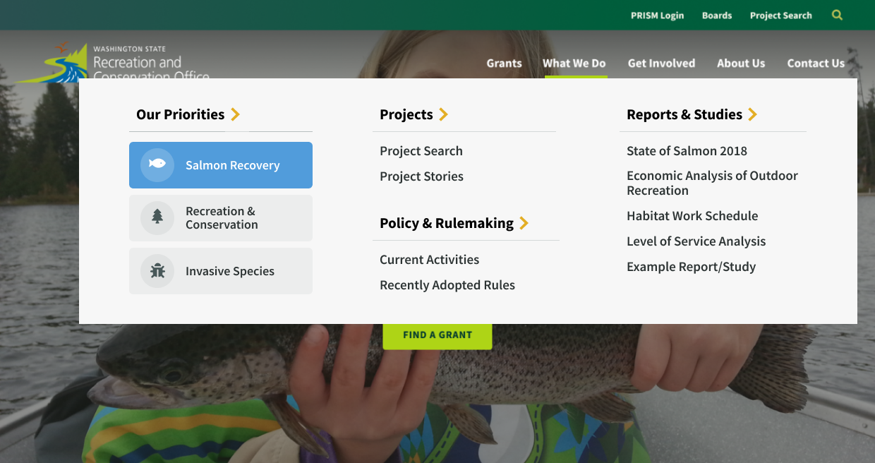
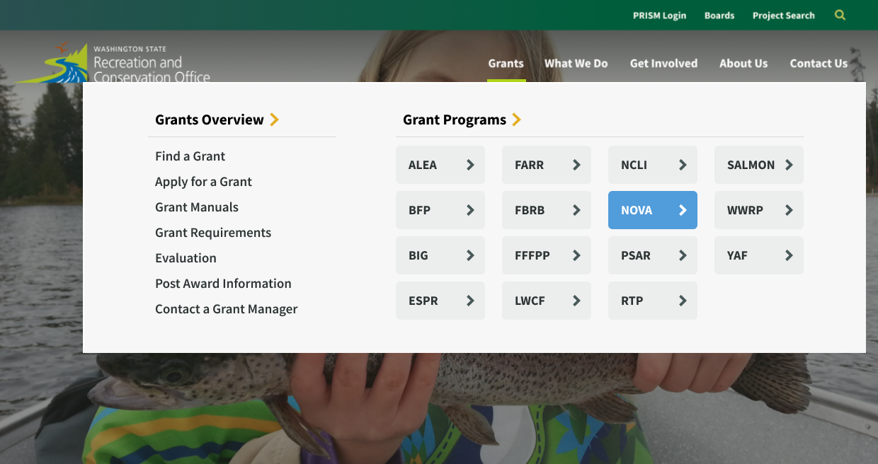
The main navigation was streamlined to provide clearer entry points. I restructured it from reflecting RCO’s org structure to instead reflect the main needs of their audience from finding grants to learning about their work and volunteering. I suggested we use a “mega menu” design pattern to give users access to more inner pages from the main menu.
02Challenge
Grant Managers were receiving too many calls from
applicants looking for grant information on the website
Research
I performed a heuristic evaluation on their website to point out where their current layout and structure choices were likely causing problems (adding to the issues we were aware of from user research).
I performed a competitive analysis to review other agencies that award grants to see what design patterns they used.
Insights
One of RCO’s main services is awarding grants, however the information applicants need was spread across many pages. From user interviews we knew that most applicants are only eligible for a few grants out of the 20 or so RCO offers, yet they had to navigate through many pages to find all the information needed for those applicable grants.
Solution
Condense the number of pages holding grant
information and optimize the grant search flow
Main Call-to-Action
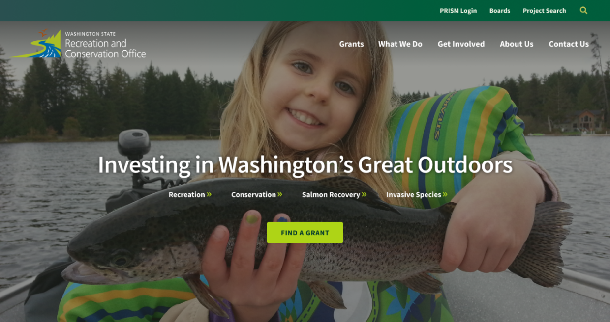
The link to grant information was brought front and center to serve as the main call-to-action button titled "Find a Grant" on the RCO home page.
Find a Grant Page
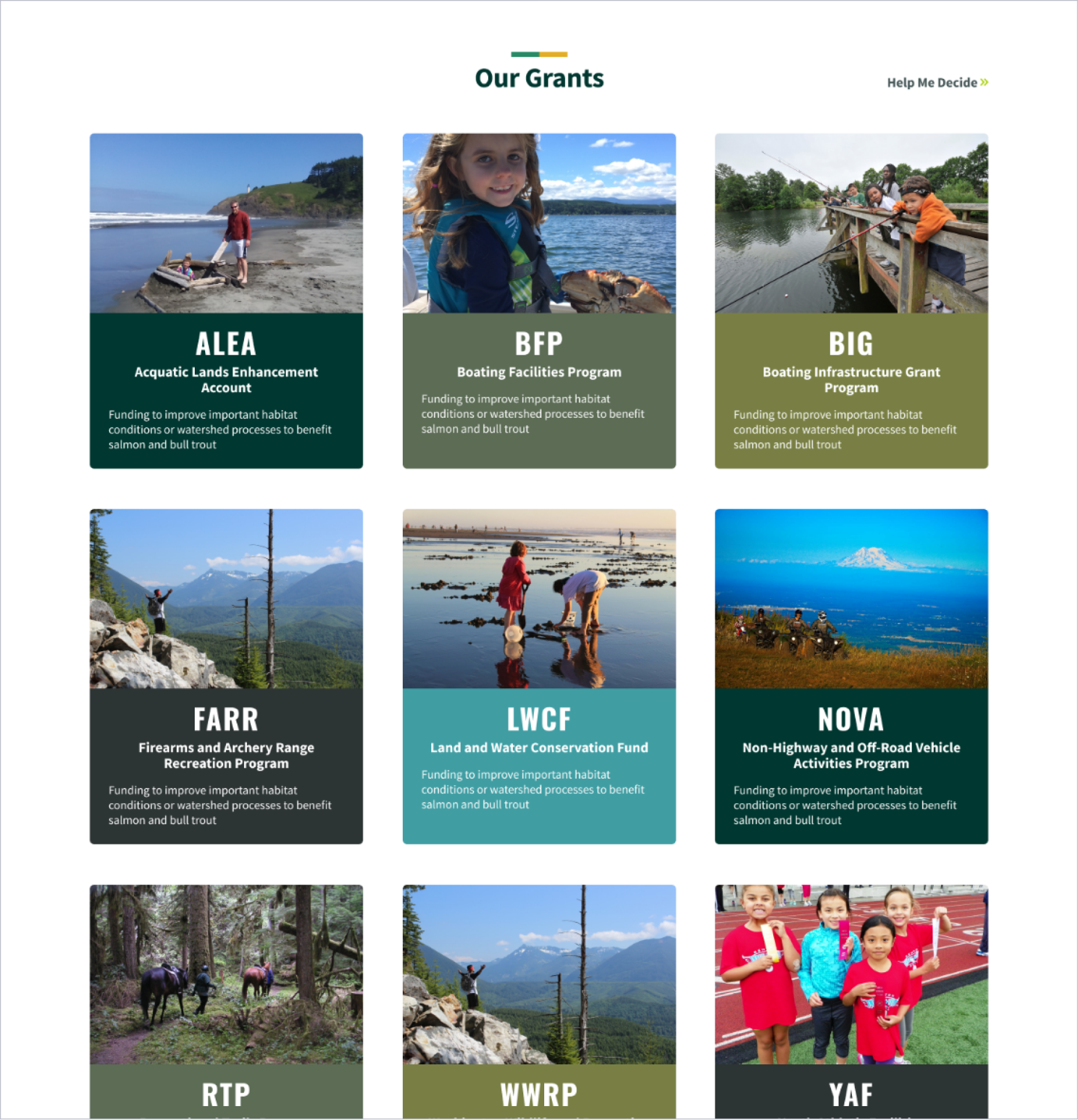
All grant programs were made easily searchable via a filter page that allows applicants to find grants they are eligible for based on project type, organization, due date, and funding range (the most relevant critieria that we determined from user research). Summaries of high-level grant information are shown as clickable cards to allow applicants to scan and compare programs.
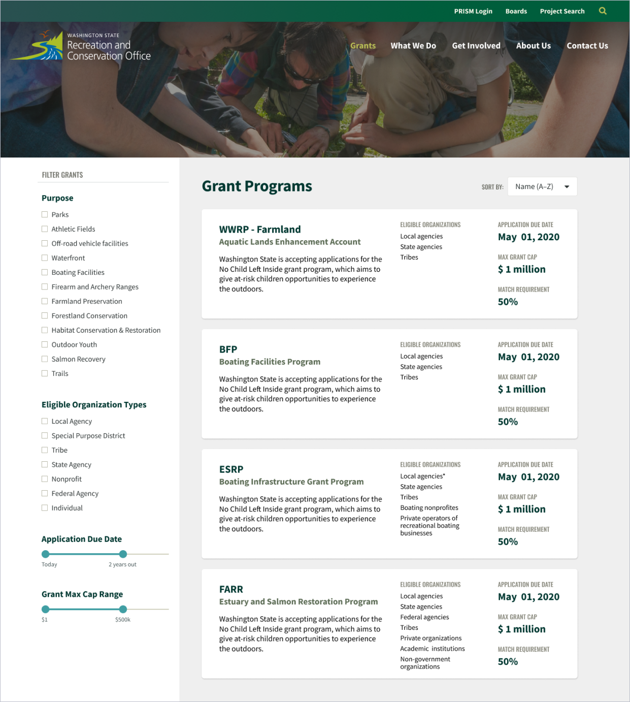
Grant "Cards"
A grant card design pattern was created as a repeatable module to be used on relevant pages where a list of all grants or a filter set of grants are needed. It provided an image, summary and link of each RCO grant program.
Grant Detail Pages
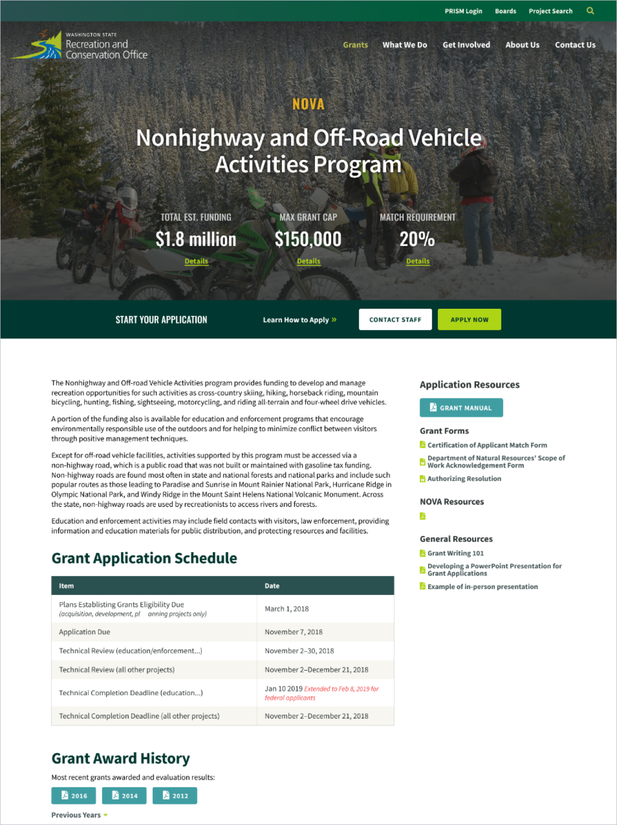
Information on individual grant programs was compiled to a single page for each from previously multiple areas of the site to better suit the worflow of applicants, most of whom are only ellgiable for several grants. In usability testing we confirmed that its much easier for applicants to get the detailed information they need by looking at a single, grant specific page.
03Challenge
Appeal to both veteran
and new grant applicants
Research
From user and stakeholder interviews, I jointly created personas representing the needs of both experienced grant applicants and those new to the process.
Insights
We learned that most of RCO’s grant applicants were veteran users who applied for grants every 2 years or when their desired grants become available. They’re familiar with the process and use the site to check for updates. Newer applicants, on the other hand, didn’t want to be left behind and needed to get up to speed in order to be competitive.

Veteran Applicant
Wants to quickly find relevant grant updates and deadlines, and wants to assess new project elligibility and competition for various funding amounts

New Applicant
Wants to learn the grant application process, find elligible grants, and assess whether its worth the effort to apply
Solution
Create optimized workflows for
both user types based on their goals
Entry Points
From the menu, we created paths for both user types. Veteran users who are already familiar with the grant programs can use the acronym links on the right to jump straight to their grant page to see updates. New applicants can use the Grant Overview menu on the left to find a relevant grant or learn about the application process.
Grant Detail Page
Grant detail pages provided quick updates and documents at the top, appealing to the needs of veteran applicants. Scrolling futher down the page reveals more detailed information about the grant requirements to educate new applicants.
Reflection
Lessons Learned
Scoping Design to Match Resources
One things we struggled with on this project was making sure our designs would be able to be executed by development within the timeline of the project. We attempted to balance the needs of the users with the budget requirements and development resources available. We created reusable design patterns and modules that could be used through out the site for this purpose. However, the size of the site and build requirements still end up straining our development resources. I think getting a solid sense of development capabilities early in the process is the best way to help scope design to any limitations.
Designing for fear of change
Something we noticed in our survey was that some experienced applicants were nervous about the site being redesigned. They already had all the resources they needed bookmarked and were worried the redesign was going to cause them hassle in having to relearn where everything is located, even if it made finding the information easier. To try to ease these fears we provided a number of recommendations to RCO for preparing users for the launch of the new site including an optional site preview and clear messaging to ease users into the launch. This is something that I will continue to watch and design for on future projects as its important to make users feel at ease with design changes that affect their processes.
Major Accomplishments
Mixed-Method Research
This project provided us with the opportunity to perform true mixed-method user research. Many of our projects didn’t have the budget to allow us to analyze user behavior from multiple data sources. These included:
- Google Analytics traffic to provide quantitative, behavioral data
- A survey sent out to a large list of users to provide us with both qualitative and quantitative, attitudinal data
- 15 user interviews to dig further into the reasoning behind the trends we were seeing
Having access to multiple sources of data allowed us to feel confident in the issues we needed to focus on solving with our designs and to confidently make that case to our client.
Early Usability Testing
Another benefit of this project was being able to schedule usability testing early in the project at the prototype stage. Testing with users who were familiar with RCO's current site and processes confirmed that we were on track with our design decisions before spending time on visual design and development. We were able to make small adjustments to improve the design while it was still cheap to do so.